CRM charts are really useful for displaying data in a summarised format, giving users a very clear picture of their data.
When designing a chart, you will set the 'Horizontal (Category) Axis Labels'
This is a wordy way of of asking ‘What do you want to group things by’. For example, you may want to group accounts by industry, or opportunities by expected estimated close date. So, you would put ‘Industry’ and ‘Est. Closed Date’ respectively in that field.
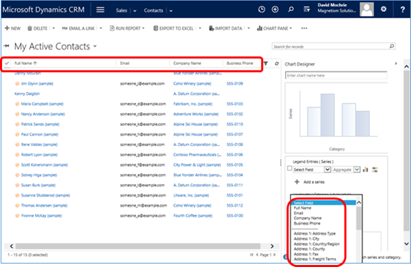
When you’re creating a personal chart, you’re given a choice of how to group your data, CRM shows you the fields from the view you’re looking at first, and then all other fields from the entity:
When you’re creating a system chart, it does broadly the same thing, but this time, as you’re in the customisations module, you’re not looking at a specific view, so it shows you the list of all fields from all public views for the entity, and then below that all other fields on the entity:
This is all very well if you want to group your data by a field which is on the entity you’re reporting on the chart. For example, if you wanted a chart to show numbers of contacts by Territory, then that’s easy. Just pick the Territory field for the grouping on the chart. However, if you wanted to group the contacts by the Territory of their parent account, you will need to have the parent account Territory field on a contact view. So, you can add this field to an existing view, or you can create a new view with the field on it. I created a new view with the field on it:
Now, when I create a chart, the parent account Territory field is available for selection:
Now, you may decide that you don’t want to have to have a view with the parent account Territory on it. Well, that’s actually OK. If you’ve added the field to an existing view, you can remove it again after you’ve created the chart, and the chart still works fine. Alternatively, if you created a whole
So, if you have a number of parent entity fields you think your users will want to use in charts, my advice is to create a view with those fields on them, then deactivate the view. This gives users more freedom when creating charts.


